Lessons learned from open sourcing the Orbit docs
This is the text version of a talk I gave at FOSDEM '22. You can see the slides from the talk.
Design systems…
If you aren’t familiar with design systems, it might help to go through some quotes from design systems I admire and drew inspiration from. This can help set the context of what design systems are for and how documentation fits help accomplish those goals.
… allow … users to build consistent digital experiences faster
Design systems provide building blocks to help build consistently great experiences. These often come in the form of component libraries or UI kits. Components that designers and developers can use to build various parts of a UI.
Because these components are all part of the same system, users can be confident they’ll work together nicely.
… help[] us work together to build a great experience
— Polaris by Spotify
Design systems are good at getting multiple people on the same page, designing in the same direction. They help make sure that various contributors, whether new to the company, experienced, or open source contributors from around the world, can work in the same direction using the same design language.
You can get many people working together and still build something that looks coherent.
… avoid repeating work that’s already been done
— GOV.UK Design System
When you’ve come up with a great solution to a design problem, you want to make sure your good decisions have broader impact. You want to know the research and work you’ve done isn’t lost.
You also don’t want to have to repeat the same discussions six months in the future, when you’ve forgotten why you made the decisions you did.
… ensure that everyone can contribute … with confidence
— Pajamas by GitLab
Design systems help bring people into your project and get started on the right foot. When they know where their contributions fit in to the overall project, they are more likely to feel good about what they’re doing. Then they’ll contribute more.
It also helps if your design system has guidelines and materials so people know how to get started.
Orbit

Orbit is the design system I worked on.
It’s the design system for Kiwi.com (including their website and mobile apps). So it’s got components for the travel industry, along with more general ones. There’s a dedicated team within the company making sure it works well for all users.
Oh, and it was recently put on a list of the best design system documentation sites.
What’s included
To help think about what is important in documenting design systems, it helps to think about what Orbit would be without documentation.
Design systems often start as a component library/UI kit. Orbit without any docs would have component libraries for various platforms. That’s a good building block to start with, but it means people would lack guidance.
It would be harder for them to know why, how, and when to use the components.
What’s needed
What is needed beyond just the components themselves:
Standards 📋
These help ensure everything works well. It includes ideas like accessibility so everyone can get the benefit of your great designs. It’s also ideas like how and when to use the components to maximize their effectiveness and minimize confusion.
Patterns 🏁
Patterns weave things together, such as various input components to make a form. They’re ways to approach specific tasks, such as handling errors in forms.
Processes 🔀
This helps get the entire team working in the same direction. It means people can focus on working collaboratively and not get lost in the details.
Guidance 🦮
People need to know how to use your components and patterns. They also need to know how to contribute to your system and keep it working smoothly for everyone.
Reasons for decisions 🧠
You want to include reasons for your decisions so you don’t have to repeat the discussions next year. By that time, even you will have forgotten why the padding is like it is. Keeping it written down means you don’t have to.
All of this needs to be communicated: documented.
Project needs
Before starting the project to switch the Orbit docs to open source, Orbit had a WordPress site. It had some great features and content. But it didn’t always live up to our own standards (such as using more than just color to communicate).
It was also far removed from code, so people who were contributing components couldn’t always contribute to the docs. In general, it was hard to update: both content and format. Content because of access control issues and format because we didn’t have PHP developers, but React developers.
We wanted it to be open source, like the React components.
Switch to


That was what was on our minds as we began the project of building a new docs site. We ending up switching to a custom built site based on the principles of docs as code.
Gatsby is a JavaScript framework for building static (and other) sites. MDX is an extension to Markdown (a simple syntax for text documents) that lets you embed JS components in Markdown.
The combination of these two meant w could use our own components in the site – its layout and its content. Using them in the layout meant the site itself could be an example of Orbit components in action. Such examples can be more useful than just words describing theories.
Using them in the content meant any changes to the components would be immediately reflected in the content itself. It kept a tight connection between the components and the docs about them.
Audience
👨🏻💻👩🎨👩🏽💻👨🏿🎨
🧑🏾💼🥷🏿🧑🏼💼🥷🏽
The first rule in creating documentation is to know who you are writing for.
Some questions to consider: Are designers and developers working with your system separately? Are they the same person just at different times? What assumptions/expectations do they have? Can you write for everyone all at once, or should you put code and design guidelines separately?
Audience informs design
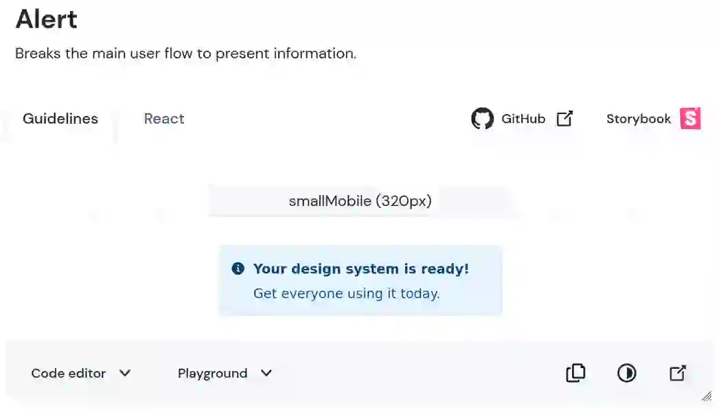
The answers to these questions helped inform some of what we did.
Knowing we had React developers come sometimes just for the API led us to put the API for React components on a separate tab, rather than the same page.
We also knew we had users who liked to experiment with the components. And that this was true for both designers and developers. So we lead each component with an example that shows the design. It gives the option to play with the code (by clicking Code editor) or design variants (by clicking Playground). So different audiences with different needs could accomplish the same goals.
This all was helped by the principle of progressive disclosure.
Provide structure
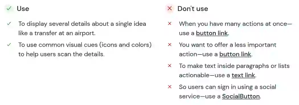
Once you know your audience, you should know something about their expectations. Help set and satisfy them with clear structure to component guidance. This consistency helps build trust in your users so they feel comfortable using it.
The article Documenting Components by Nathan Curtis is great on this, going through various tradeoffs for choices.
The structure helps you provide enough information without it seeming to be overwhelming. Breaking it down into chunks makes it easier for people to find what they need.
So instead of long paragraphs describing everything about a component, we can break it down into lists. And even more than that, each example of when not to use a component provides an alternative. This means users aren’t left alone, just told what not to do. Instead, they get a clear alternative that might fit their use case.
Our structure
For Orbit, we settled on this structure:
- Intro – A short description of the purpose of the component.
- Example – So people can get right to playing with the component and testing its API.
- Usage – When to use/when not, with links to what to use instead.
- Status – Which libraries the component is ready in, or if it’s just an idea that will come later.
- Content structure – What parts the components has, like icons or text, and how to think about them.
- Behavior – Guidance on interactions, responsive behavior, and details on use.
- Content – For content design (words, images): How to fill it in and what words to use, such as advice on starting calls to action with a verb.
- Look & feel – Varieties and especially the reasons behind design decisions so as not to argue over them again in 6 months.
The last three items were optional and each made more sense in some components and less in others.
Structure → templates
Once you have a structure, you can help people contribute to your docs by creating templates. These should include examples of the syntax (like the example of how to include an interactive example) and explanations for what to include. This helps people get comfortable with your system.
Make it easy to contribute
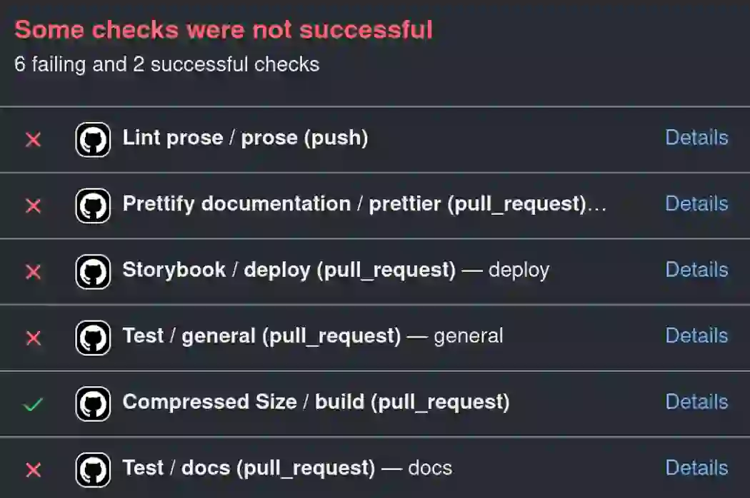
The point of design system documentation is to guide contributors in the same direction. So make sure it’s easy to contribute.
It’s nice to enforce style guidance through linters such as Vale. But you want as few errors as possible. Otherwise, people are discouraged and don’t contribute. So make sure the errors you’re marking are truly errors and not just recommendations that you could fix yourself.
This also applies to things like the process to get your docs site running locally. You want it as smooth as possible.
Make it accessible

This is one of the general principles of Orbit, but make sure your guidance is accessible to everyone. For example, don’t rely on only color. If our comparison of when to use and when not to use a component was just red vs. green, many people wouldn’t be able to tell which was which. We use shapes, structure, and aria labels to make it clearer.
Add some flair
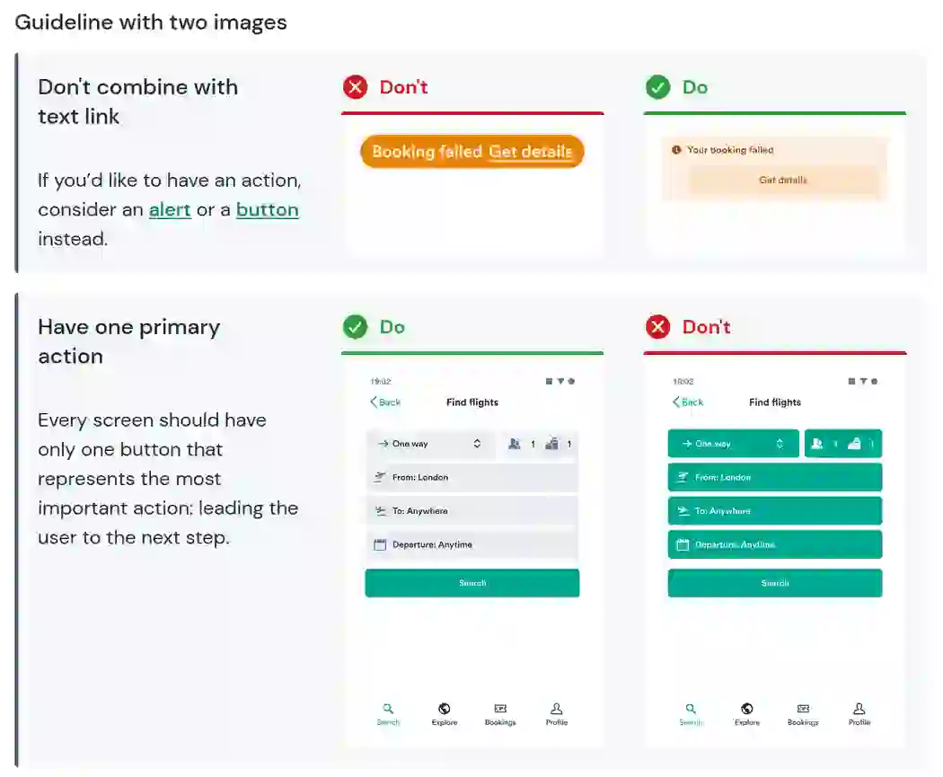
It’s an important foundation to make sure all of your information is accessible even if it’s not visual. But for those people who can access visual information, it can help to create some visual interest to engage them in your system.
We created some components to make the docs more visually interesting. There’s a page at Orbit.kiwi that shows all of them in action, which helps in visual testing and for contributors to see how they work. See the Orbit MDX components in action and at the source.
More than components
As I noted previously, documentation for design systems needs more than just components. We included other ideas in our Orbit docs as well.
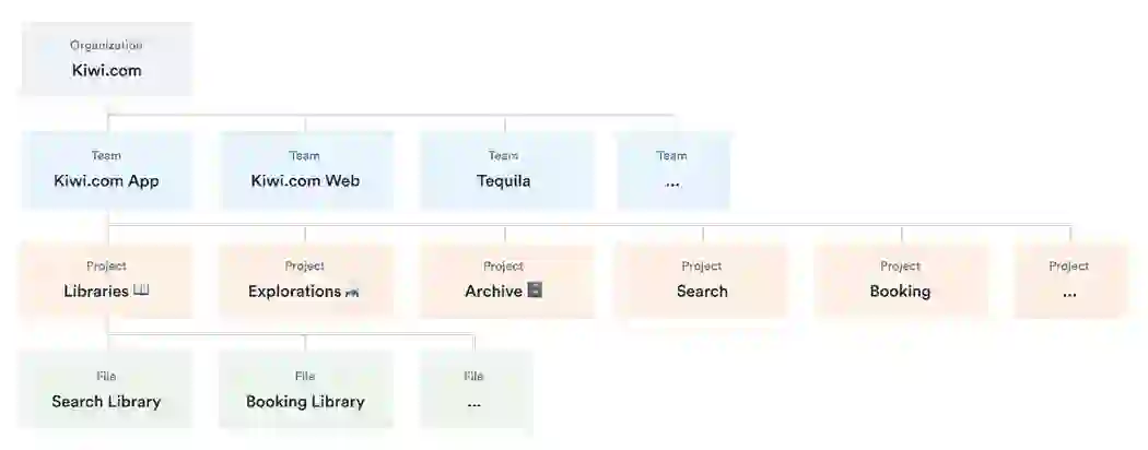
We’ve documented processes, such as file organization in Figma. This helps make sure we’re not duplicating work and people don’t have to waste time on finding things.
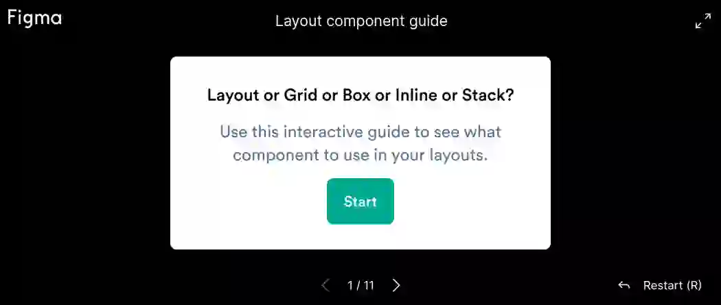
We also have patterns and other things that cut across components. Such as interactive decision trees to decide which component to use in which case. This helps narrows users focus down to designing or coding for their use case, rather than thinking about the system. We created an interactive guide for action components (like buttons) and one for layout components.
The goal in each case is to get people to the work they want to do, using the design system as a helper, not a hindrance.
Put it all together
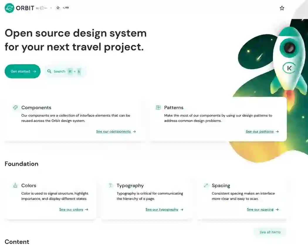
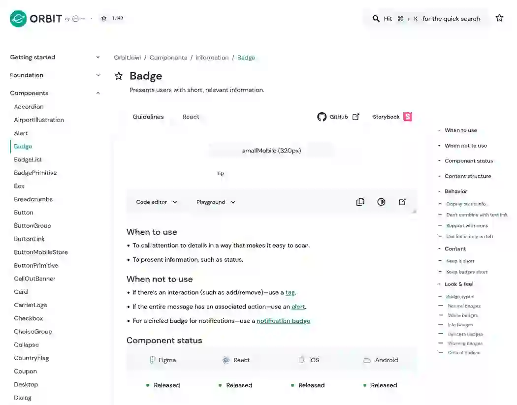
Then you need to use your design wizardry to make the entire experience feel like part of a coherent whole.
Or, in my case, take advantage of the better designers on your team to get the docs feeling like a smooth experience.
Iterate
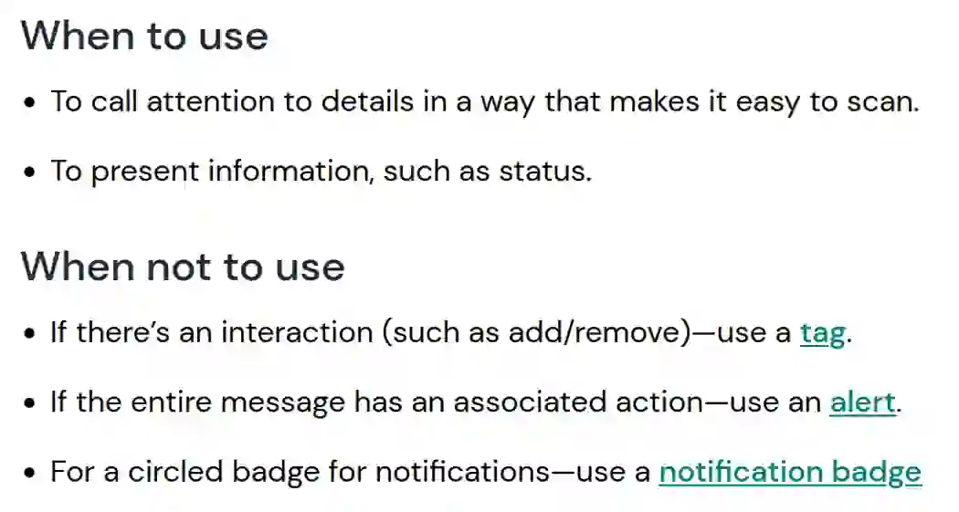

When you’ve finished the first part of your project, it’s time to gather feedback, see what works, and make it all better. For example, Orbit moved from plain nested lists to side-by-side lists with color.
Always be open to seeing what isn’t working and thinking about how to get the best experience for your readers.
Thanks to
Thanks to the wonderful team at Orbit who helped put the docs site together:
 Will Kolmačka
 Milan Seitler
 Matija Marohnić
 Victor Genaev
 Luděk Vepřek
We may not be working together every day anymore, but větrníks fly forever.
