
This based on a talk given at the Write the Docs Prague 2019 conference (watch the video).
Why we document
As a documentarian, I create content that is intended to help someone else understand something. I write what I do in the hope that someone will learn from it and then be successful and feel good enough about the project that they’ll keep using it. This is what keeps my job important: the people who use it.
So for my docs to be the best they can be, they have to help readers achieve their goals. To do that, I have to know who my readers are and what they’re trying to achieve. Another way to put that is that as documentarians, a lot of what we do is translate across contexts and to do that we need to know what the context of the reader is likely to be.
You never really understand a person until you consider things from [their] point of view — until you climb into [their] skin and walk around in it.
Atticus Finch in To Kill a Mockingbird by Harper Lee
Once I have an idea of who my users are, I can adjust what I’m doing to try to fit what will help them best. It’s no good having a process written exactly as it’s done if it’s written in a way that my readers won’t learn from, such as if it’s using terminology that’s nothing they’ve heard of before. So I need to try to meet users where they are.
But I don’t always spend my day doing these things. I’ll take a look at some problems we faced at Kentico Kontent a year ago that led us to seeking a fresh perspective.
Common daily work
- We had most features documented
- We spent our time:
- Tracking changes
- Updating existing docs to reflect changes
- Adding in docs on new features
- Most input was from developers
- Maintaining knowns
Most of our work involved things from inside our own circle. We spent our time primarily within the company, building on ideas from developers and others who know our product really, really well. Even when we added new things, we added them on a base of deep knowledge of what we were trying to achieve, what our tool expects, and how we can expect it to behave.
Uncommon daily work
- Processing user feedback/speaking with users
- Reworking existing docs unprompted
- Relearning how to work with the product
- Working with our product outside our own context
- Other perspectives
We didn’t spend a lot of time with ideas from outside our sphere. We like feedback on our docs, but we rarely get much that’s constructive. We have started working extensively with our own project as part of migrating all our docs into a single portal, but we have customers who use the product for many different reasons and we had little contact with that.
User experience mapping
To try to address this, we turned to a concept from UX: user experience mapping. This comes from the idea of customer journey mapping, which is intended to help designers understand how people become customers and decide to use a given tool. In our case, we want to focus on how people interactive with a service for the tool: the documentation. I wanted to know how people interacted with different parts of the docs and whether those interactions helped them achieve what they were trying, in other words helped them be successful.
It’s important to focus on the docs experience within the overall experience, to map out what people are doing before and after they come to the docs. This helps us see things we might not otherwise. I also focused especially on how they feel at each point, so we can building on the positive feelings and try to address the more negative ones.
Experience map examples
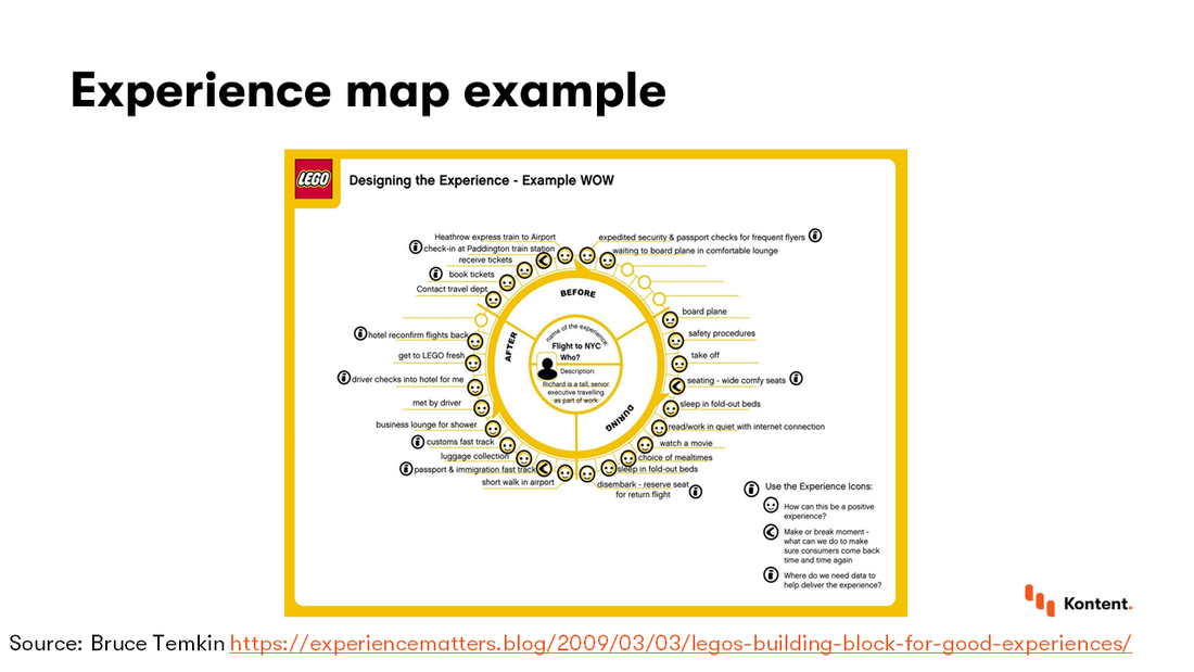
The first example of experience maps comes from Lego via Bruce Temkin. It describes how an executive might experience a plane trip from London to New York. Note that the map includes information on a time scale as it goes around and this is divided into trip section. Each interactive is given an emotion or other icon to indicate its importance. The focus here is places where intervention will have the most return or where there is missing data.
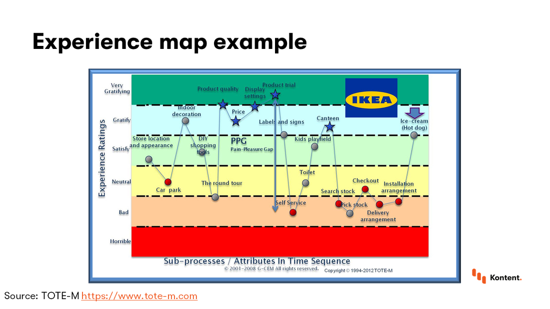
The second example comes from IKEA via TOTE-M. This is a map of a trip to a physical IKEA store. Again, it goes through the experience over time and maps out the emotions associated with each step in the trip. People might not like the round experience at first, but might be pleased by the products. You can also note that people might drop out of the trip if they don’t like the products.
Another interesting point is how frustrated people get toward the end when they have to find the actual product, pay for it, and arrange delivery. Because of such feelings, IKEA knows it has to make people happier at the end. You can pick up an ice cream or other treat and leave feeling satisfied and like you accomplished something, which might make you remember the trip as more positive than you would have without this step.
Doc experience mapping
To map our docs readers’ experience, we took these main steps:
- Gather information about who reads our docs
- Create personas for our readers
- Meet and go through the journey as each persona
- Act on the insights
Gather experience
We don’t get a lot of actionable feedback from our users because, outside of maybe documentarians, very few people are excited to give feedback on docs. ut we got help from the research by our wonderful UX team. We just needed to adjust their general findings to make them useful for our own specific context (the docs). We also added in some other sources (analytics, support tickets, marketing/sales research) to complete the picture. Now that we had a lot of information, we had to organize it into a useful form.
Create personas
We borrowed another concept from UX, namely personas. These are ways to categorize our users into groups based on things they have in common. This helped us process the info we have on our readers so that we didn’t have to deal with all the data at once. We then gave each group a name and a face so we could relate to the people better. This step really helps us get empathy for our users and better understand things from their perspectives.
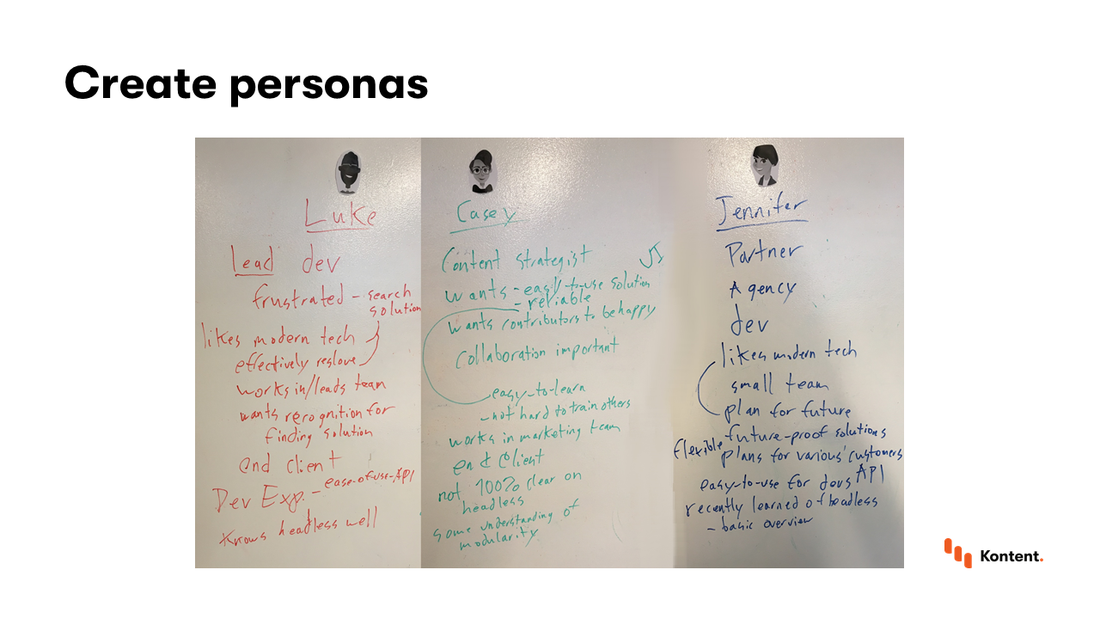
This photo shows how it looked when we met and started creating our personas. You can see each group has a name and a face and then a bunch of characteristics that makes them similar. We went through things like where they work, what they do, how they’re connected to Kentico Kontent, and what their goals are.
Our created personas
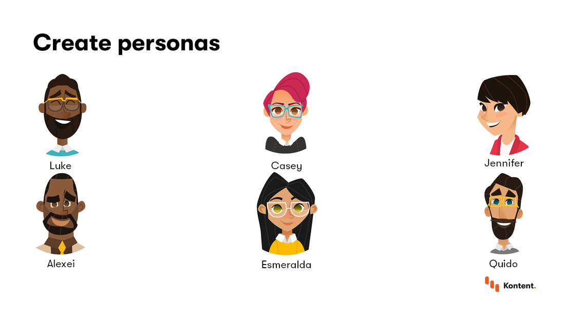
We ended up creating six personas. Kentico Kontent is a Content as a Service solution, so we include have a wide variety of users, including technical and nontechnical users and people who create projects and people who just implement pieces of it. Our docs have to help all of them so we have to know how they all might experience our docs.
Who Esmeralda is
We’ll look at the persona of Esmeralda, who’s a technical person, but not one who chose our tool. She was brought on by someone else and has to adapt to everything. But she’s not really interested in learning the tool or its concepts; she just wants to get her immediate task done. That’s important to think about as she approaches our docs.
She wants easy to use examples and copy and paste code. She doesn’t understand general concepts about our service and doesn’t want to. She just wants support for her favorite technology.
Esmeralda’s experience
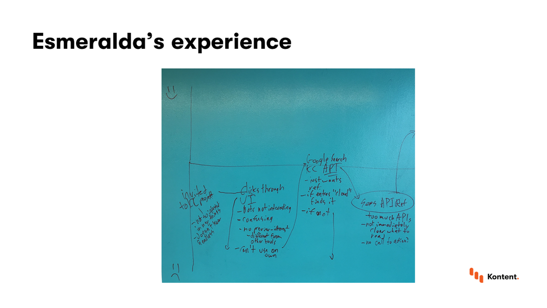
This is a picture of our actual map that I drew on the wall. As you can see, we chose a simple timeline with a second dimension of user happiness. We also marked the interactions with our docs differently that those with our parts of our product. Esmeralda is invited into a content-related project and has to figure out how to get that content to display to fit her business requirements. That happens before she gets to us.
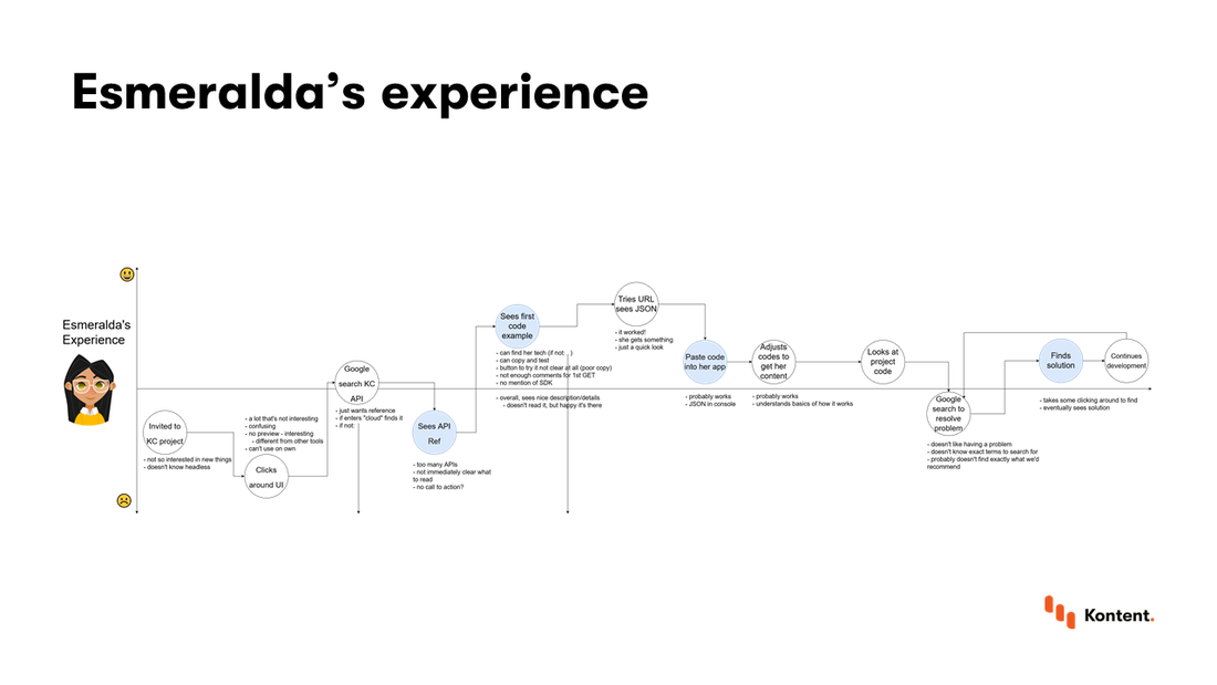
We transferred my scribbles to a more readable form. The details aren’t important, but you can see the times when she interacted with our docs in a different color than other things she did.
It’s important to note that this is not the only path that someone who fits the Esmeralda persona could act. We created a possible path and had to guess at how she would act in each situation. When we were mapping this, we talked about what she would do outside the docs, but when she started interacting with anything in the docs we tried to actually do that ourselves so that we could look at what she would see with our own eyes.
This led to us discovering some things that were useful about our docs.
What Esmeralda’s experience taught us
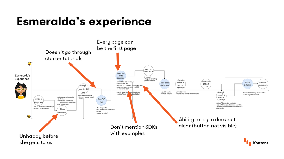
From looking at our docs through Esmeralda’s eyes, we can see a few things:
She’s unhappy before she gets to us:
The reason she comes to the docs is because of a problem, so she already has negative feelings.
She doesn’t read our starter tutorials:
Although we’ve created some nice starter tutorials to introduce concepts and get people up and running, she doesn’t care about them and doesn’t read them. She heads straight for the first page.
Every page can be the first page:
This is a concept we knew from a great book on the subject, but it was good to see it in practice, even though it meant we hadn’t made use of its message in our docs.
Our examples didn’t mention our SDKs:
This is an example of us not putting it into practice. We didn’t mention the SDKs we have for each technology in our examples for that tech. So people might come to an example and see syntax for a package they don’t have or know about. That can create confusion.
The ability to try endpoints wasn’t clear:
We had a button to try things in the docs directly, but the color blended into the background. Even though we knew it was there, we almost overlooked it ourselves.
Luke’s experience
Now we can look at our map of Luke’s experience. Luke is also a developer, but he’s the one who chooses Kentico Kontent and sets up the project and then invites other people.
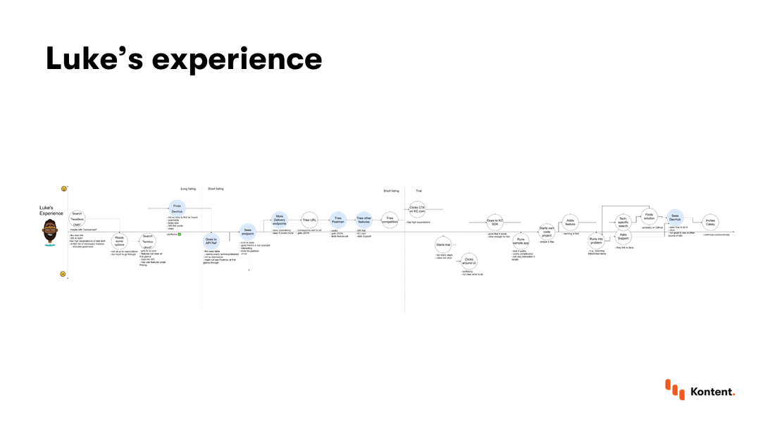
He has a long journey that involves a lot of experimenting with the product and thinking about what is possible. He does a lot less of trying to implement specific features than Esmeralda did.
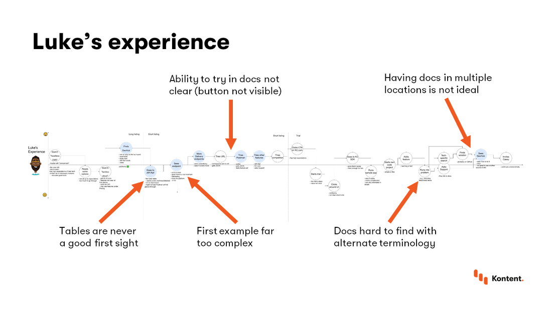
From looking at our docs through Luke’s eyes, we can see a few things:
Tables can be ugly:
Our API introduction started with a table of all our APIs. That wasn’t a good sight and it wasn’t even necessary for the info we had there.
The first example was too complex:
The first example was trying to show a lot of different things at once. The basic call for content and also filtering, paging, and so on. This was too much for an evaluator to grasp at one time.
The ability to try endpoints wasn’t clear:
As with Esmeralda, we saw this again.
Specific docs are hard to find with alternate terminology:
We wrote our docs to match the terms we used in Kentico Kontent. There’s a lot to be said for the approach of consistency, but it makes it harder for people to find the docs they want when they’re searching using the terms they use in their everyday lives.
Multiple locations for docs isn’t ideal:
For various historical reasons, we had separate places with docs, including a strict division between technical and nontechnical help. This made sense at the time, but it made it hard to deliver a consistent help experience that people would understand.
What we did for Esmeralda and Luke
- Made the Try it button more visible
- Removed the table
- Simplified the first example and made it more educational
- Tried to make examples consistent
- Created tasks for finding and implementing users’ terms
- Long-term project of migration to a single portal
We tried to take the things we learned from these experiences and translate them into actions that would improve their feelings on our next map. These are just some of the examples, but some things were easier to implement (like making the button a different color), while others are still ongoing projects.
Casey’s experience
Just to show you a different side of our docs, I’d like to show you Casey’s experience.
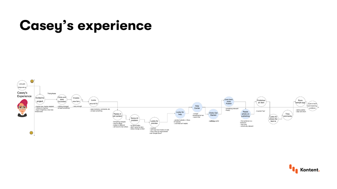
Casey is a content strategist: a nontechnical person who’s in charge of exploring new tools and making sure they’ll work for content needs. She has some idea that APIs and other concepts exist and knows there are benefits, but isn’t really interested in the details.
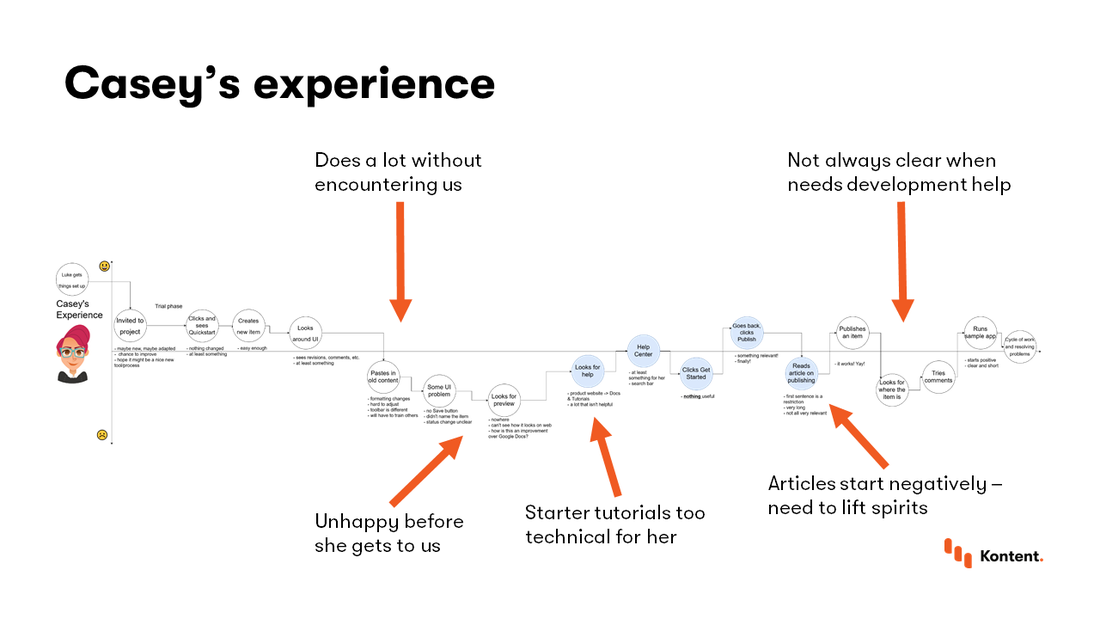
The first thing we noticed is just how much time she spent with Kentico Kontent before she got anywhere near the docs. She plays around inside our application, but doesn’t see a need to go to the docs until she runs into some problem. At that point, she’s feeling a little negative about the experience: she’d rather be able to solve it herself than have to ask for help by going to the docs.
We also noticed that we had gaps in our nontechnical docs. Most of the getting started materials were about developing apps, not managing content. And it wasn’t always immediately clear in the nontechnical articles when additional development would be needed.
Lastly, we noticed that we had some articles that started with restrictions. These were important details, but they started off by telling Casey that she couldn’t do something she wanted to before she had any idea of what was possible. When you combine this with the fact that she came to us with negative feelings, you can see that she might leave feeling bad about our docs.
What we did for Casey
- Make all articles start positively
- Created more nontechnical articles for technical concepts
- Created tasks for teaching people to set up environments
We tried to address some of these insights firstly by lifting Casey’s spirits when she comes to the docs. That meant starting with what is possible before getting into what isn’t possible.
We also started projects to help bridge the gap between technical and nontechnical docs and also moved them both into the same portal, as I mentioned for Esmeralda and Casey.
Main takeaways
Documentation is about helping people be successful at what they are trying to accomplish. To do that, we have to understand what they want. We can do that by mapping the experience of users (representation as personas) as they use our docs.
For us, this was a four step process:
- Find out about your readers
- Put them into categories and create personas
- Explore how each might experience your docs
- Act on your insights
I hope you can see how this might help you in your own documenting. If you’d like to discuss this more (or anything about Kentico Kontent, like how to use it to build static sites or manage docs), contact me through one of the ways at the very top of this page. I’d be happy to talk more about it.